Graphical representation of data
 A
pie chart
showing the composition of the
38th
Parliament of Canada.
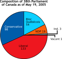
A
pie chart
showing the composition of the
38th
Parliament of Canada.
A
chart
(sometimes known as a
graph
) is a
graphical representation
for
data visualization
, in which "the
data
is represented by
symbols
, such as bars in a
bar chart
, lines in a
line chart
, or slices in a
pie chart
".
[1]
A chart can represent
tabular
numeric
data,
functions
or some kinds of
quality
structure and provides different info.
The term "chart" as a graphical representation of
data
has multiple meanings:
Charts are often used to ease understanding of large quantities of data and the relationships between parts of the data. Charts can usually be read more quickly than the raw data. They are used in a wide variety of fields, and can be created by hand (often on
graph paper
) or by computer using a
charting application
. Certain types of charts are more useful for presenting a given data set than others. For example, data that presents
percentages
in different groups (such as "satisfied, not satisfied, unsure") are often displayed in a
pie chart
, but maybe more easily understood when presented in a horizontal
bar chart
.
[2]
On the other hand, data that represents numbers that change over a period of time (such as "annual revenue from 1990 to 2000") might be best shown as a
line chart
.
Features
[
edit
]
A chart can take a large variety of forms. However, there are common features that provide the chart with its ability to extract meaning from data.
Typically the data in a chart is represented graphically since humans can infer meaning from pictures more quickly than from text. Thus, the text is generally used only to annotate the data.
One of the most important uses of text in a graph is the
title
. A graph's title usually appears above the main graphic and provides a succinct description of what the data in the graph refers to.
Dimensions in the data are often displayed on
axes
. If a horizontal and a vertical axis are used, they are usually referred to as the x-axis and y-axis. Each axis will have a
scale
, denoted by periodic graduations and usually accompanied by numerical or categorical indications. Each axis will typically also have a label displayed outside or beside it, briefly describing the dimension represented. If the scale is numerical, the label will often be suffixed with the unit of that scale in parentheses. For example, "Distance traveled (m)" is a typical x-axis label and would mean that the distance traveled, in units of meters, is related to the horizontal position of the data within the chart.
Within the graph, a
grid
of lines may appear to aid in the visual alignment of data. The grid can be enhanced by visually emphasizing the lines at regular or significant graduations. The emphasized lines are then called major gridlines, and the remainder is minor grid lines.
A chart's data can appear in all manner of formats and may include individual textual
labels
describing the datum associated with the indicated position in the chart. The data may appear as dots or shapes, connected or unconnected, and in any combination of colors and patterns. In addition, inferences or points of interest can be overlaid directly on the graph to further aid information extraction.
When the data appearing in a chart contains multiple variables, the chart may include a
legend
(also known as a
key
). A legend contains a list of the variables appearing in the chart and an example of their appearance. This information allows the data from each variable to be identified in the chart.
Types
[
edit
]
Common charts
[
edit
]
Four of the most common charts are:
This gallery shows:
- A
histogram
consists of tabular frequencies, shown as adjacent rectangles, erected over discrete intervals (bins), with an area equal to the frequency of the observations in the interval; first introduced by Karl Pearson.
[3]
- A
bar chart
is a chart with rectangular bars with lengths proportional to the values that they represent. The bars can be plotted vertically or horizontally. The first known bar charts are usually attributed to Nicole Oresme, Joseph Priestley, and William Playfair.
[4]
- A
pie chart
shows percentage values as a slice of a pie; first introduced by William Playfair.
[5]
- A
line chart
is a two-dimensional scatterplot of ordered observations where the observations are connected following their order. The first known line charts are usually credited to Francis Hauksbee, Nicolaus Samuel Cruquius, Johann Heinrich Lambert and William Playfair.
[6]
Other common charts are:
Less-common charts
[
edit
]
Examples of less common charts are:
This gallery shows:
- A
bubble chart
is a two-dimensional scatterplot where a third variable is represented by the size of the points.
- A
polar area diagram
, sometimes called a Coxcomb chart, is an enhanced form of pie chart developed by
Florence Nightingale
.
- A
radar chart
or "spider chart" or "doi" is a two-dimensional chart of three or more quantitative variables represented on axes starting from the same point.
- A
waterfall chart
also known as a "Walk" chart, is a special type of floating-column chart.
- A
tree map
where the areas of the rectangles correspond to values. Other dimensions can be represented with color or hue. Smaller areas go to the bottom right corner.
- A
streamgraph
, a stacked, curvilinear area graph displaced around a central axis
- A GapChart, a time series chart showing evolving gaps and equalities between series. Other dimensions can be represented with color or hue.
Field-specific charts
[
edit
]
Some types of charts have specific uses in a certain field
This gallery shows:
- Stock market prices are often depicted with an
open-high-low-close chart
with a traditional bar chart of volume at the bottom.
- Candlestick charts
are another type of bar chart used to describe price movements of an equity over time.
- A
Kagi chart
is a time-independent stock tracking chart that attempts to minimise noise.
- Alternatively, where less detail is required, and chart size is paramount, a
Sparkline
may be used.
Other examples:
- Interest rates, temperatures, etc., at the close of the period are plotted with a line chart.
- Project planners use a
Gantt chart
to show the timing of tasks as they occur over time.
Well-known named charts
[
edit
]
Some of the better-known named charts are:
Some specific charts have become well known by effectively explaining a phenomenon or idea.
Other charts
[
edit
]
There are dozens of other types of charts. Here are some of them:
One more example:
Bernal chart
Common plots
[
edit
]
Chart software
[
edit
]
While charts can be drawn by hand, computer software is often used to automatically produce a chart based on entered data. For examples of commonly used software tools, see
List of charting software
.
See also
[
edit
]
Wikimedia Commons has media related to
Chart
.
References
[
edit
]
Further reading
[
edit
]
Wikiquote has quotations related to
Chart
.
|
|---|
| Fields
| |
|---|
Image
types
| |
|---|
| People
| | Pre-19th century
| |
|---|
| 19th century
| |
|---|
| Early 20th century
| |
|---|
| Mid 20th century
| |
|---|
| Late 20th century
| |
|---|
| Early 21st century
| |
|---|
|
|---|
Related
topics
| |
|---|