Original EXAMPLE:
 Picture #1:
 Picture #2:

Picture #1 - not featured
[
edit
]
 Support
? Cool! ?
H92
(
t
·
c
·
no
)
14:48, 12 May 2007 (UTC)
[
reply
]
Support
? Cool! ?
H92
(
t
·
c
·
no
)
14:48, 12 May 2007 (UTC)
[
reply
]
 Info
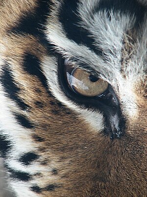
This would benefit from some work in Photoshop. The blacks look washed out, but that should be easily fixable. --
MichaelMaggs
20:40, 12 May 2007 (UTC)
[
reply
]
Info
This would benefit from some work in Photoshop. The blacks look washed out, but that should be easily fixable. --
MichaelMaggs
20:40, 12 May 2007 (UTC)
[
reply
]
- It's interesting that you mention that. If you look at the file upload history, you'll see that I intentionally darkened the blacks from the original version. I, and some others I showed it to, prefer the one with darker blacks and more contrast. Perhaps it's personal preference or something, but on my monitor the blacks appear fine. But yes, the detail is just not there. Cest la vie. --
Ram-Man
21:22, 12 May 2007 (UTC)
[
reply
]
 Oppose
I do not feel like any specific subject asserts itself within the photo. I'd prefer to see either more of the animal at large or more detail of a specific part; not an in-between area. ...Would it be too much to ask for a closer photo??:) Decent detail, though. Also: the blacks appear washed out on my screen. --
Thisisbossi
02:07, 13 May 2007 (UTC)
[
reply
]
Oppose
I do not feel like any specific subject asserts itself within the photo. I'd prefer to see either more of the animal at large or more detail of a specific part; not an in-between area. ...Would it be too much to ask for a closer photo??:) Decent detail, though. Also: the blacks appear washed out on my screen. --
Thisisbossi
02:07, 13 May 2007 (UTC)
[
reply
]
- Support
it could be brighter but i like the moment --
Bergwolf
18:57, 13 May 2007 (UTC)
[
reply
]
- This was shot
through glass
on a snowy day when myself and another professional photographer were unable to get a great shot of this animal. My wife, who took this picture with her point-and-shoot, managed to capture what was in my biased mind a special shot. The camera wasn't able to capture the subtle detail in the black hairs and the resulting contrast was too low. I darkened the blacks (because there wasn't much detail there and it was a little noisy) to increase the contrast. The original version is still in the file history. --
Ram-Man
19:06, 13 May 2007 (UTC)
[
reply
]
Info
Please place new votes below. Vote for (or against) one or both.
result:
 3 support, 2 oppose, 0 neutral => not featured. --
Ram-Man
 11:45, 23 May 2007 (UTC)
[
reply
]
 Comment
Re: the closing. I know it makes little difference, but the above votes were at least cast for picture #1 below, if not for both pictures. If the first picture should be closed, then all the votes under "Picture #1" should be counted. As a result, I've updated the count. --
Ram-Man
11:45, 23 May 2007 (UTC)
[
reply
]
Comment
Re: the closing. I know it makes little difference, but the above votes were at least cast for picture #1 below, if not for both pictures. If the first picture should be closed, then all the votes under "Picture #1" should be counted. As a result, I've updated the count. --
Ram-Man
11:45, 23 May 2007 (UTC)
[
reply
]
Picture #2 - featured
[
edit
]
- Support
(I prefer this color corrected version) --
Ram-Man
15:03, 14 May 2007 (UTC)
[
reply
]
- I uploaded a photoshopped version with better colour, hows that? I missed that Info bit up the top about the version history, woops, having both next to each other still allows for better comparison i guess.
Chris huh
09:46, 14 May 2007 (UTC)
[
reply
]
- Support
new version. Thanks. -
Susanlesch
15:02, 14 May 2007 (UTC)
[
reply
]
- Support
--
Simonizer
06:35, 15 May 2007 (UTC)
[
reply
]
- Support
- One of the nicest things in Commons:FPC (unlike WP:FPC) is that we can vote for the pure beauty of an image without having to prove its encyclopedic value...
Alvesgaspar
07:52, 15 May 2007 (UTC)
[
reply
]
- Support
I still think it could be better, but maybe the colour tones would no longer be realistic?--
Benjamint444
07:57, 15 May 2007 (UTC)
[
reply
]
- Support
--
MichaelMaggs
13:08, 15 May 2007 (UTC)
[
reply
]
- Oppose
colour cast
Lycaon
06:19, 16 May 2007 (UTC)
[
reply
]
- Oppose
- I can't really explain it, but I really don't like the angle, for some odd reason it seems very "uncomfortable" to me (I still can't figure out a good way to explain this, I'm very sorry). Maybe it's something about how the top of the eye is covered by the lashes, or the composition. --
Pharaoh Hound
21:47, 18 May 2007 (UTC)
[
reply
]
- Support
the colours in this one do seem more natural than the others.
Chris huh
11:14, 19 May 2007 (UTC)
[
reply
]
 8 support, 2 oppose >> featured -
Alvesgaspar
 16:51, 24 May 2007 (UTC)
[
reply
]
