Posted by
Jolanda Verhoef
, Android Developer Relations Engineer, and
Anna-Chiara Bellini
, Android Toolkit UI Product Manager
It’s been almost a year since
Jetpack Compose
1.0 was released, and during this time we've seen the community adopt it with enthusiasm. You’ve told us you’re appreciating the conciseness of the Kotlin syntax and the declarative approach that makes thinking about UI so much faster and easier.
Compose in the Community
We've seen many
companies adopt Compose at scale
for the newest and boldest features of their apps. For instance, we've worked closely with the
Play Store team
, who started experimenting with Compose in the very early days, and learned that not only is it more enjoyable, it is beneficial to their developer productivity. They told us that "
All new Play Store features are built on top of this framework. Compose has been instrumental in unlocking better velocity and smoother landings for the app.
" The team at
Twitter
has been using Jetpack Compose across different parts of the app, and they are reaping the benefits, as
"Compose makes it much easier to define our own components and to make their API contracts more explicit, flexible, and intuitive."
The
Airbnb
team adopted Compose as well:
"Jetpack Compose is a critical part of our technical strategy. The productivity gains are massive."
We're very glad to see that these teams, who have carefully evaluated Compose in large, complex production environments, are experiencing not just more fun and clarity in their UI development, but broader engineering benefits! And these are just a few examples, because over 100 of the top 1000 apps in the Play Store are now using Compose.
These close collaborations, and listening carefully to feedback from the broader Android community, are always at the heart of our development process and are key to advancing our
roadmap
. We're now focusing on supporting your more advanced use cases, with new APIs and feature improvements, all together with new tools to make building with Compose easier. We know that Compose fundamentally changes the way UI is built. To help you with the necessary mindset shift, we're publishing more guidance, talks and codelabs on advanced topics, and more in-depth videos so you can write apps that look great and perform great. Here's what is new:
Compose 1.2 beta
Today, we’re releasing the
first beta version of Compose 1.2
, which includes a lot of features and improvements.
Text improvements
Font Padding
We’ve addressed
one of the top-voted bugs
in our issue tracker by making
includeFontPadding
a customizable parameter. We recommend you set this value to
false
, as this will enable more precise alignment of text within layout. We aim to eventually make this the default value in a future release. Please let us know in the issue above if setting the value to
false
leads to issues with your app. Additionally, when
includeFontPadding
is set to
false
, you can adapt the line height of your Text composable by setting the
lineHeightStyle
parameter. Combined it can look like this:
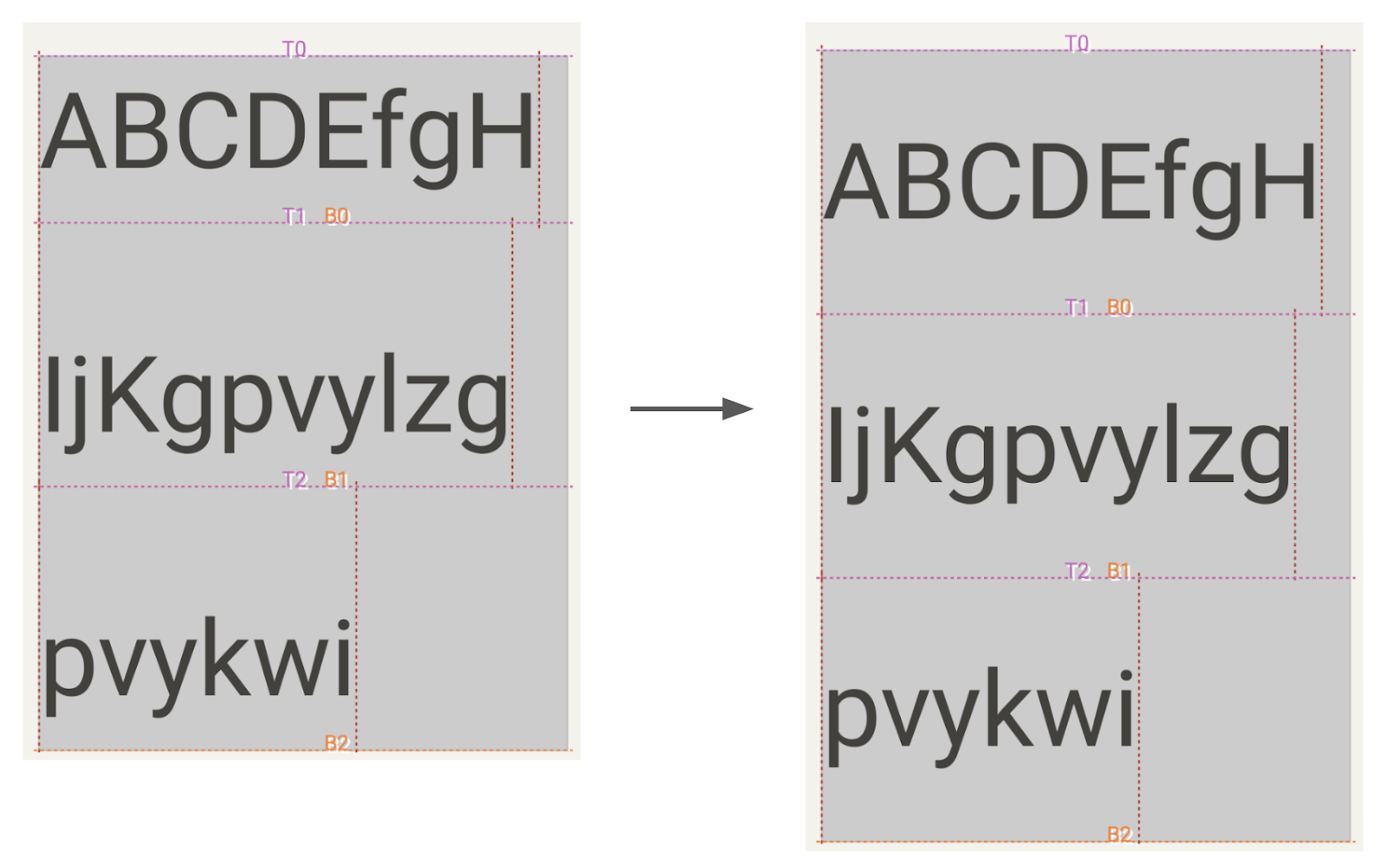
Multi-line Text with includeFontPadding set to true (left, current default) vs false (right) and lineHeightStyle.
Text(
 text = myText,
 style = TextStyle(
   lineHeight = 2.5.em,
   platformStyle = PlatformTextStyle(
     includeFontPadding = false
   ),
   lineHeightStyle = LineHeightStyle(
     alignment = Alignment.Center,
     trim = Trim.None
   )
 )
)
Downloadable Fonts
Compose 1.2 also introduces
downloadable fonts
in Compose. You can use the new APIs for Compose to access Google Fonts asynchronously, even defining fallback fonts, without any complex setup. With downloadable fonts, you can keep your APK size small and improve your user’s system health as multiple apps can share the same font through a provider.
Text Magnifier
Android text provides a magnifier widget, which makes selecting text easier. Compose now supports the text magnifier.

The magnifier is shown when dragging a selection handle to help you see what’s under your finger. Compose 1.1.0 brought the magnifier to selection within text fields, and now Compose 1.2.0 supports magnifier in both text fields and
SelectionContainer
. The magnifier has also been enhanced to match the precise behavior of the Android magnifier in Views.
Layout features and improvements
Lazy Layouts
Lazy layouts continue to evolve, with the grid APIs
LazyVerticalGrid
and
LazyHorizontalGrid
graduating out of experimental, and a new experimental API being added, called
LazyLayout
, that lets you implement your own custom lazy layouts. Learn more about these APIs in the I/O talk
Lazy layouts in Compose
.
Interop with CoordinatorLayout
When you embed a scrolling composable in a
CoordinatorLayout
from the view system, you can now make sure their scroll behaviors are interoperable. This makes the setup of a collapsible toolbar much easier. You can opt-in to this behavior by passing the result of calling the new experimental
rememberNestedScrollInteropConnection
method into the
nestedScroll
modifier. Here’s a
sample
demonstrating this new functionality.
Window insets
The
insets library in Accompanist
has now graduated to the Compose Foundation library, using the
WindowInsets
class. Read more about it in our documentation on
Integrating Compose with your existing UI
.
Window size classes
To make it easier to design, develop and test resizable layouts, we’ve released window size classes - a set of opinionated viewport breakpoints. They are now available in alpha in a new library
material3-window-size-class
, as part of the Material 3 set of libraries. You can read more about size classes in the
Supporting different screen sizes documentation
and take a look at a
sample implementation in Crane
.
Focus on performance
To help you understand and improve your app’s performance, we focused a lot on new performance tooling and guidance. With this, it becomes much easier to understand why and where your app might be lagging.
Starting from Android Studio Dolphin, you can inspect how often composables recompose using the Layout Inspector. Unexpectedly high numbers of recomposition can point you to a composable that could be optimized. In addition, Android Studio Electric Eel now includes a recomposition highlighter, a visual aid to see which composables recompose when. Read more about this new tooling in the
What’s new in Android Studio
blog.
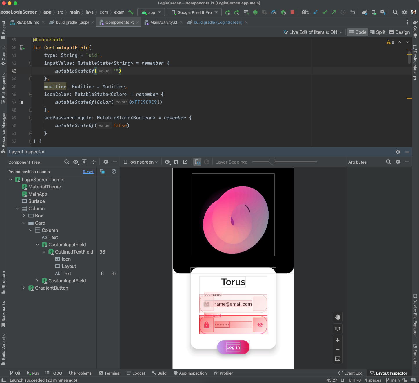
Layout Inspector showing recomposition count and recomposition highlighter.
Compose changes the way you write your UI at a fundamental level, so there are some best practices that you can adopt to make sure your app is performant. The newly released
documentation page
suggests how to write and configure your Compose app for best performance. In the I/O talk
Common performance gotchas in Jetpack Compose
, the Compose team describe common performance mistakes and how to fix them.
Performance is an ongoing area of focus and we’re working hard on improving and extending tooling and guidance. In the meantime, we’d really appreciate your feedback on the work we’ve done so far. Please raise your bugs in the
issue tracker
or ask your questions on the
KotlinLang Slack group
.
New tools
On top of improvements, there are also new tooling updates to help you use Compose more effectively.
Android Studio Dolphin
, now in Beta, brings exciting features for Compose development. Beyond recomposition counts, new tools include Animation Coordination so you can see and scrub through all your animations at once, and the MultiPreview annotation to help you build for multiple screen sizes. To enable you to iterate faster Android Studio Electric Eel (in Canary) brings LiveEdit.
Check out
What's new in Android Development Tools
for all the details, and make sure you share your feedback to help shape the tooling support you need for Compose.
Compose for Wear OS
If there is something better than Compose, it is more Compose! So we're very excited to see Compose for Wear OS moving to Beta! Following the same principle as any other Jetpack library, Beta means that it's feature complete and API stable, and you can start building your production-ready apps. Go ahead and read the
blog post
!
New and improved guidance
We’ve added and revamped a lot of the guidance on Compose:
Happy Composing!
We hope that you find these new features as exciting as we do. If you haven't started yet, it's time to learn
Jetpack Compose
and see how it will fit in your team and development process, so that you can experience all the benefits of improved velocity and developer productivity. Happy Composing!
